It won’t have escaped even the most casual of Monopoly players that the royal-blue Mayfair space is the most expensive property on the board, making it heavenly to own, but game-ending to land on with your opponent’s hotel in situ. It is surely the former of these two sentiments that the developers had in mind when they co-opted the name for one of the grandest properties ever to grace this particular corner of the New Territories.

At T7 Mayfair By the Sea, the property certainly honours the legacy of its boardgame namesake. With views over Plover Cove and the nearby country park, this 2017-completed residence also meets one of the key contractual specifications of the initial design brief – seamless integration with its surroundings.
Recalling the guiding principles that drove this distractingly beautiful development from the start, Brian Chan, a director at BCD, the Hong Kong-based design firm that conceived and executed the project, says: “Our aim was always to create something of an oasis amid the concrete jungle that is Hong Kong. Embedding nature into the heart of the interior was thus our prime objective.

“Perhaps the best comparison would be a commission to make a bespoke suit for a discerning client who has specified that the lining and the exterior of the outfit should both embody the same functional and aesthetic considerations.”
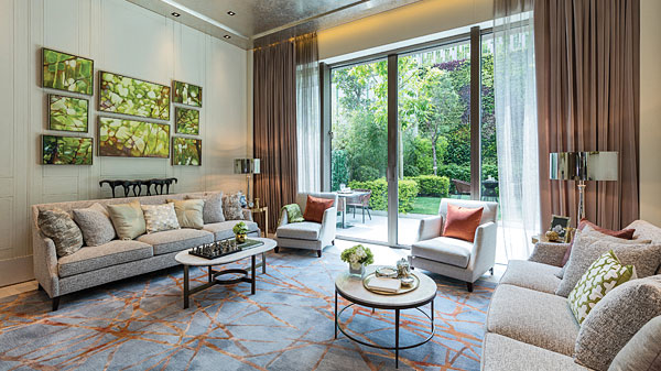
With this holistic approach a given from the outset, the challenge for Chan and his colleagues was to incorporate as many natural elements as possible without ever making the completed home look forced or cluttered. Starting from such a standpoint, it was obvious that optimising the natural light levels was going to be integral to the project’s success.

This is epitomised in the living room, the natural centrepiece of any home. Bathed in natural light, courtesy of its strategically-angled floor-to-ceiling glass doors, cunningly-sited over-sized wall mirrors then reallocate much of this exterior illumination to the residence’s less-immediately-accessible nooks and corners.
For the bedrooms, the colour palette has been toned down just enough to turn the relaxation factor up to 11, while still maintaining the home’s perfect unity of feel. Once again, generously-proportioned windows have been deployed, making basking in the unfiltered morning light a true treat.

While it goes without saying that particular care has been taken to ensure that none of the fixtures and fittings jar with the room’s organic sensibilities, one or two still merit singling out. The choice of the black-and-white check bed frame, for instance, was surely inspired, perfectly complementing the bronze metallic-style bedding.
Although it would be hard to predict the bespoke boudoir look simply from the style of the reception rooms, its elegant variation adds a roguish note of digression to the home’s overall feel, while never venturing so far as to disrupt the overarching coherence or compromising its sheer livability. The quirky use of irregular panels, lined with gold metal plates, for instance, strikes a very different note to those found elsewhere in the structure, but without ever eliciting any sense of disconnect.

Of course, if you’re going to finely tune the feel of the interior to the exterior sensibilities, making the outside worthy of equal celebration has to be a priority. Here, once again, the BCD team definitely didn’t disappoint.
Indeed, the property’s spacious, well-appointed and delightfully understated terrace is one of the project’s true high-water marks. Amid its artfully-arranged luxuriant foliage nestles a set of outdoor furniture that looks so in place that it might well have grown there. It’s the perfect spot for the family to congregate and commune as the sun goes down or to greet the new day with freshly-squeezed orange juice and a croissant or two.

Giving something of an insight as to how this al fresco asset was conceived and implemented, Chan says: “With our aim always to optimise the tranquil feel of this space, our design team and the client jointly concluded that retaining as much of its artifice-free feel as possible was definitely the way to go. Ultimately, we just sensitively enhanced what was already there, while making sure its full potential was ably realised, which was pretty much our mantra for the whole project.”
Text: Robert Blain
Photos: BCD


