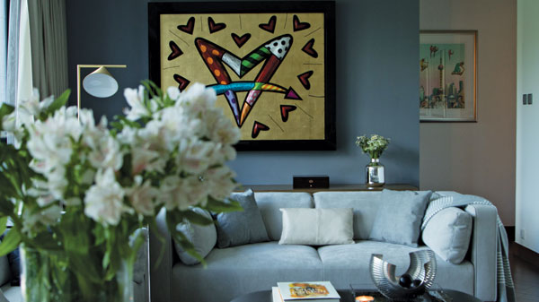
“Ultima” is just a little short of ultimate, which makes it pretty much the perfect name for one of Ho Man Tin’s finest home complexes. Completed just three years ago, this sept-colonnaded residential block is family friendly to the nth and superbly positioned.
To the southeast, the development has truly splendid sea views out across both Kai Tak and Lei Yue Mun, while, in strict contrast, the southwest offers panoramic oversight of the urban sprawl that is Central / Wan Chai, with such international landmarks as the International Finance Centre and the International Commercial Centre clearly discernible. Given its geographical advantages and peerless connections, it’s small wonder that, last year, the complex also became home to the most expensive (per sq.m) parking space in the whole of Asia.

This accolade came about when a second-floor parking space within the complex changed hands for HK$6 million (US$770,000). The space was sold on the second-hand market for 12 times its original price (HK$500,000) and easily outstrips the price paid for the previous record-holder – an 8.2sq.m space in Sai Ying Pun that had earlier fetched HK$5.18 million.
Despite being set in such a salubrious location, when one particular family chose to relocate to Ultima, not everything – initially at least – was entirely to their satisfaction. Indeed, when Zill Li – a husband and father to two kids – first settled upon one of the development’s larger apartments, he liked pretty much everything, except some aspects of the interior design, preferring a “more connected style” for what was destined to become the long-term family home.

Realising the family needed a design team that shared its vision of just how the apartment could be judiciously reinvented, Li threw the net wide, determined to only work with a business he felt was truly simpatico. In the end, that search took him right to the doorstep of Clifton Leung Design Workshop, an award-winning Hong-Kong based specialist in interior decor.
Renowned for his ability to seamlessly fuse the functional and the stylish, the challenge for Clifton Leung, the eponymous founder of the design consultancy, was to reinvent the space as a commodious-enough environment for the day-to-day living of a family of four, while also ensuring there was enough storage space for their current and future needs. It was a challenge he savoured, saying: “I prefer to work within smaller spaces. It’s where I can really be challenged and where I can have more fun.”

Designed to be a home away from home – with the family spending much of its time on the mainland – the brief was to create an apartment that had a hotel-like ambience – both modern and minimalist in style – while remaining warm and welcoming. Another requirement that needed factoring in was the family’s love of art, particularly as they owned a highly-valuable collection of their own, which they were keen to display and immerse themselves in on a day-to-day basis.
Thankfully, the design team proved capable of taking all of these requirements in its stride. The success of the minimalist approach, for instance, is now clearly apparent as soon as you set foot in the dining or the living rooms. With the physical barriers between these hub spaces eliminated, natural light flows between the two, while their open-ended continuity embodies both free-ranging warmth and room to flourish and indulge.

The sheer capaciousness of this co-joined space makes it ideal for forefronting cherished artworks, allowing them to be suitably venerated without being obliged to jostle for wall real estate with consumer electronics items. Maximising the impact yet more, the family’s primary TV set has been recessed at ceiling level, with an adjunct projection facility allowing for programming to be viewed on a discreet drop-down screen.
The same love of flow-through space that characterises the dining / living area is again in evidence in the master bedroom, where a one-time dividing wall with the study has been dispensed with and succeeded by a slidable portal. This acts to unite the two spaces in both function and feel, while opening the area up to all family members.

The same sense of spatial fluidity – although here mixed with a welcome playfulness – is again on show in the bespoke bedrooms created for the junior family members. Embodying a beguiling, covert clubhouse motif, the entrance to these particular sleeping spaces are secreted behind an unassuming cupboard fascia in the central living room. It’s a fine conceit with which to capture the affection of the younger householders.
The love and loyalty of the more senior stakeholders have, of course, already been secured by the myriad of subtle touches and knowing affectations that have made this transformation so satisfyingly complete and so completely satisfying.
Text: Bailey Atkinson
Photos: Clifton Leung Design Workshop


