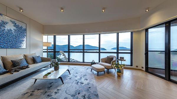
While some prefer their dwelling to be an ostentatious statement of wealth and power, others prefer a more subtle form of indulgence. An exemplary example is this Tai Tam home, spanning 2000 exquisite sq ft within the Pacific View residential complex. Home to a family of four, the brief here was to evoke an understated sense of luxury, taking on more pared back features and toned-down hues to highlight the joy of simplicity, comfort and the intimacy of a convivial space.

Key to transforming the space into a cosy family abode, was designing with comfort and functionality in mind. Given the homeowners’ background – their warm and modest personalities, coupled with a cultured taste for elegance and sophistication – Wanson Wan, director of Wams Design, chose to embody those characteristics throughout the apartment, comprising a living-cum-dining room, balcony, laundry room, and four spacious bedrooms.
“The homeowners”, Wan said, “wanted a space that was classy. Something that resembled a hotel suite, but not too lavish in style either. Special attention was given particularly to their two children’s rooms, while the kitchen was also given priority to effectively layout an efficient space to cook family meals.” The result: A seamless flow of beautiful, yet functional, spaces that beckoned the family and their guests with a warm welcome each time they set foot in the home.
Room with a View

Fist stepping into the main area, in place of entertainment consoles and a television as the anchor of the living space, a simple coffee table stands between the sofa and lounge chair facing a display shelf of books and art pieces – hinting at the homeowners’ preference for intimate connection. Here, the boundless views of large framed windows that stretch across the length of the apartment serves as the focal point of the area. Framed by the black boarder of the windows and spotlighted by the LED lights that line up both top and bottom edges of the windows, the serene seascape of the pristine waters of Tai Tam Bay evokes a colour-infused artwork in a gallery.

Reflecting the natural palette of the view outside, the bespoke rug, floral arrangement and paintings on the wall conjure up airy and almost poetic nautical ambience that was said to set the art direction of the overall design. This was achieved by carefully selecting the most ideal materials, furniture and decor from a myriad of luxury brands and a huge library of materials to sample. The living room, bathroom and hallway, for example, is fitted with a combination of top-graded stone, wood and sumptuous fabric that sets the tone throughout the home. Meanwhile, warm colours from decorative touches of artworks, floral arrangement and furnishing contrast the cooler, airy tones of the ceilings and walls. The lighting, too, was a thoughtfully added layer for depth, where décor was minimal, whether it is the pendant light above the dining table or LED lights that line the boarders of the windows and bathroom mirrors.
Creative Space

Moving towards the kitchen, here is where the lady of the house spends her time cooking up recipes for the family. As a full-time mom, this space serves as a work station for all her passionate culinary creations and wondrous experimentations. Not to mention that the size of the space was considerably wide in length, instead of the typical width that most kitchens are structured in. So, Wan had given thought to the placement of each cooking equipment and tool in a layout that would afford the owners maximum efficiency to prep, cook and clean.

Stepping into the more intimate quarters of the home, the master en suite continues the same theme of muted luxury and airy, white-and-blue colour palette as the living space. Meanwhile, the master bathroom, complete with a bathtub and his-and-her sinks, features metallic tones and glass panels that expand the sense of spaciousness and modern charm.
Kid’s Corner

However, it was in the planning of the children’s bedrooms that extra attention to detail was served. Contrary to the clean lines of the main family room, the children’s chambers boast fun-filled décor, activity platforms and consoles that define the various zones for playing, reading, studying and sleeping.
Designed with loosely spaced furniture, open book shelves, and an easily accessible storage system for a safe, flexible and versatile area, this was deliberately done to, not only prompt the children to move and explore independently, but to also allow them to learn the responsibility of cleaning up their own personal space.

From one room to the next, homely touches evoke a soothing sense of well-being. Away from the distraction of the bustling city and surrounded by nature, colour and creativity. In this home, minimalism gives way to brighter spaces, clearer minds and undisturbed family time.
(Text: Roberliza Eugenio; Photos: Wams Design)


