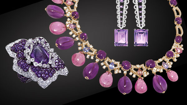
Officially Pantone’s colour of the year, 2018 is set to be dominated by all things violet, with amethysts, sapphires and jade gems set to characterise runways and street fashions alike. Eagerly embraced by colour experts as truly replete with “ingenuity, originality and visionary thinking”, it’s hard not to wonder why Pantone’s iridescence-minded boffins took quite so long to plump for this clearly indispensable shade. It’s not as if the clues weren’t there.
Even Pantone concedes that musical icons as diverse and as chronologically-disparate as Bowie, Hendrix and Prince long ago flagged-up the varied brands of unconventional creativity associated with this particular blue-based purple hue. Hopefully incorporating the memorable expressions of individuality synonymous with these much-missed musos, we could be in for 12 months of conspicuous non-conformity, all of it – admittedly – violet-tinged.
It would be a folly most errant, however, to neglect the significance of Pantone’s decision to plump for this off-plum pastel as The Tint for Our Times. Indeed, as Leatrice Eiseman, Pantone’s executive director, so sagaciously reminds us: “The Pantone Colour of the Year has come to mean so much more than just what’s trending in the world of design. In essence, it’s a reflection of what’s truly needed in our world today…”
Should it turn out, however, that the wider world fails to aptly respond to Pantone’s careful, annual consideration of all things prismatic, churning out its usual fare of mass shootings, climatic cataclysms, premature expirations and dodgy commercial dealings, then it might well have proved better all-round had the New Jersey-based pigment-pickers opted for Sprout Green instead. We may never really know for sure.


