To live in a home of undeniable beauty and unquestionable comfort is the aspiration of many and one that does necessarily entail occupying an immense palace, complete with a grand hall and sundry ornate trappings. In fact, it is the intelligent use of a space customised to the precise needs of residents that is now most prized among many home-hunters, with small, wellthought-out details and an active embodiment of the owner’s personal aesthete seen as something of a bonus.

Arguably, just such a dwelling is the Tseung Kwan O home of a family of five in the leafy Papillions development. For the lucky couple and their three children – two sons and a daughter – it is indeed something of a dream home, one where they have been able to specify many of their individual needs and particular preferences.
Extending across some 2,186 square feet, this two-storey dwelling embodies a modest European style, albeit with several notably luxurious touches. Designed three years ago by Connie Cham of Hei Design, an award-winning Kowloon Bay-based interior design specialist, the home is, in many ways, redolent of contemporary design at its very best. Throughout, such fine and naturally textured materials as wood and marble have been deployed to deliver a gentle blend of modern elements and functional design.

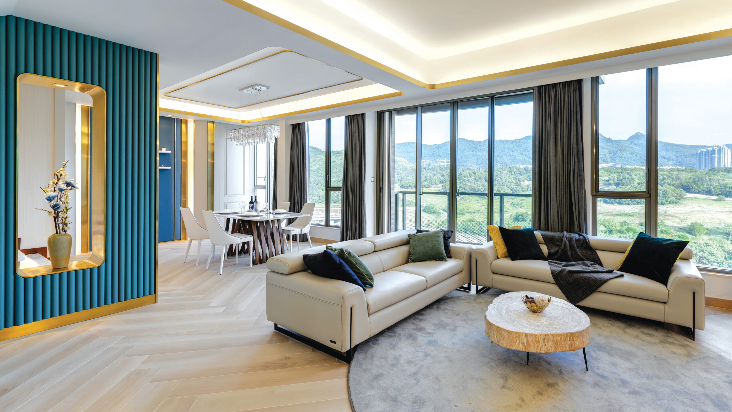
The spacious living/dining area, for instance, looks out over the stunning surrounding natural landscape via a series of wide, wall-length apertures, making the home bright and brimming with natural light. It’s also a space with direct access to a wide balcony, the ideal spot for enjoying the morning breeze and relishing the lush mountain views. The apt use of such reflective colours as white, blue and gold only adds to the lustre, bestowing a regal theme to the interior. In addition, a complimentary combination of blue and green seems to bring the natural exterior surroundings into the very heart of the home.

For its part, the living room sees a number of key features artfully highlighted, most notably a marble staircase with an extended base, the risers of which furl into different contours for each step. As part of the restructuring, it was repositioned to face the dining area instead of the living room, allowing it to define the two areas. Its original column has been artfully hidden by a double-sided divider, accented by faux leather upholstered ribbed panels with brushed steel inlays.

In a move that makes the entrance yet more spacious and grand, the design team resized the maid’s room and installed a glass sliding door in place of a wall, with the kitchen door now both facilitating airflow and creating a more open space. The height of the unit has also been adjusted via the incorporation of dropped ceilings into the living area and the master bedroom space.

Another focal point in the ground floor hall is a feature wall in the dining area, one layered with wall coverings and delicate metal inlays that extend through the ceiling to the feature wall of the adjacent living area. This space also boasts a moulding panel with a jib door and recessed LED strips, which provide a luminous backdrop to the dining table, creating a cool ambiance for family meals. In a touch to relish, the bespoke furniture and lighting match the whole theme, adding to the undoubted elegance of the interior.

Moving to the upper floor, this is divided into three expansive bedrooms, making it an exclusive enclave for family members. Understandably, the master bedroom is the most spacious and features a commodious closet with a desk, allowing it to double up as both a study and storage area. A feature wall, dressed in blue and gold upholstery similar to that found in the dining area, meanwhile, serves as a fetching headboard for the kingsized bed.

The room also makes good use of the same layered effect evident in the living area, with its dropped ceiling rimmed with gold acting almost as a skylight. With access to a small balcony and wide windows throughout, the room is often heady with the surrounding scents of nature. In a nice touch, the ensuite bathroom has been designed with simultaneous dual use very much in mind.

With the bedroom of one son set on the ground floor, this allows it to be reallocated to guests should the need arise. The other two children occupy rooms on the first floor, with each of their spaces uniquely themed in line with their personal preferences. The daughter’s room also grants access to the attic, enhancing both the room’s functionality and storage capacity. Throughout, the layout of both floors intentionally optimises the views across the outdoor greenery. This ensures that, despite the undeniably luxurious nature of its interior, the home remains perfectly in simpatico with nature, one of the key requirements in the initial design brief.
(Text: Zaira Abbas; Photos: hei design)


