To say that Tino Kwan, the award-winning lighting designer extraordinaire, is something of a legend in design circles is putting things mildly. After all, the born-and-raised Hongkonger has masterminded the stunning lighting designs of some of the world’s most iconic properties, ranging from the recently-completed refurbishment of the iconic Raffles Singapore hotel to the sumptuous The Peninsula Tokyo.
As Kwan prepares to celebrate the 40th anniversary of his company, Tino Kwan Lighting Consultants (TKLC), he chatted with Gafencu about his favourite projects to date, the basic do’s and don’ts of lighting design and his upcoming Unity of Light exhibition, which kicks off on 11 October at the Hong Kong Arts Centre.
With TKLC celebrating its 40th anniversary, what do you think have been the key factors of your success?
I never set out to be a famous designer. Being a perfectionist, though, I always like to strive for the best. When it comes to design, I challenge myself to do better for every project. Also, I’m passionate about learning, which also helps me become a better designer. Lighting is a marriage between technology and art, and with new technologies emerging everyday, I’m always on my toes to make sure that I’ve learnt every aspect of what’s out there. I think these two facets have really helped me to constantly raise the bar over the years.

Of all the various projects you’ve worked on, do you have a favourite?
It’s quite difficult to choose, but if I had to pick, there are three that stand out. The first is the award-winning The Peninsula Tokyo, which I did the lighting for some fifteen years ago. Two years ago, I was invited back for the10th anniversary party and when I went in, the lighting had been kept entirely the same. I was very pleased that my designs had withstood the test of time.
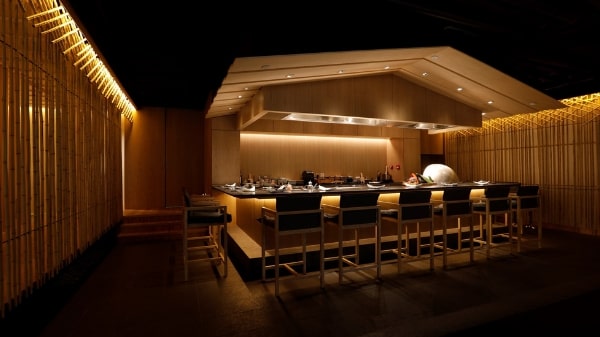
The next project is a Japanese restaurant at Lee Garden 2 called Ta-ke. The interiors were designed by Kengo Kuma, the famed Japanese architect, in collaboration with my very good friend, Steve Leung. I had to work with two design masters, and it wasn’t easy. Kengo-san’s design concept was very minimalist, focussing solely on one material – bamboo. In the end, I managed to get into his mindset and employed an equally minimal lighting concept. It was a great success, and he even said: “Tino, you made my bamboos come alive!”
My final favourite is the new St Regis Hong Kong which I just finished. It’s a beautiful project, a medium-sized hotel but very cosy. The lighting in the whole hotel is very human-scale and creates an atmosphere that’s almost like a home away from home that you want to return to. That was the key idea, and I think that’s the beauty of the lighting in that hotel.

What are the key essentials to good lighting design? Conversely, what are some common mistakes?
Good lighting doesn’t have to be complicated. My lighting is always simple and minimalist, but very powerful. Lighting needs to be comfortable, it needs to enhance the space and gift it with various focal points. There also has to be different layers of lighting to make the space richer. A lot of common mistakes tend to run to the opposite, to the overly-complex – too many lights, confusing layouts or dull designs… Sometimes, when entering a room, you automatically feel uncomfortable for no reason. Usually, that’s due to bad lighting.

Can you tell us more about your upcoming Unity of Light exhibition?
To give you a little background, I held my first exhibition – also at the Hong Kong Arts Centre, ten years ago to showcase three decades of my work. This time, I want to do more. I want to appeal not only to design circles, but also to the public at large. My mission, after 40 years, is really to draw attention to the importance of lighting and to educate the public on the concepts of lighting design.
This exhibition, which is called Unity of Light, features several highlights. The first is a maze through which attendees can view my various projects. As a special touch – which is a bit of a secret – I’ll be using the neon signs that are a Hong Kong trademark not only for the commercial kind of shops but also as signages for all the design clients and companies on display. The maze is also fitted with mirrors to create a reflective effect that will enhance the entire experience.

Also, while creating this exhibition, we simultaneously created a film titled The Story of a Hong Kong Boy. I was born and raised here, and I’m a proud Hongkonger. The film is an autobiographical account of my journey to becoming an internationally successful lighting designer. I want to share my experience and pass this message to the Hong Kong public.
Last but not least, with an eye to educating the public, I have collaborated with Gary Chang, a master designer of multifunctional small spaces, to build a 180sq.ft ‘nano-home’ for a couple. Using lighting as a major element, I want to demonstrate how lighting can enhance a small space, and how the use of technologies can really enhance everyday life.
Thank you.
Interview by: Tenzing Thondup


